如何選擇塗鴉風格:五種工具效果比較
Tagvoro · 更新日期:2026-10-19
Culture
Graffiti styles guide
From the one-line tag to interlocking wildstyle — what each style is, where it came from and how writers build it. Every image was generated with Tagvoro.
Tag (handstyle)
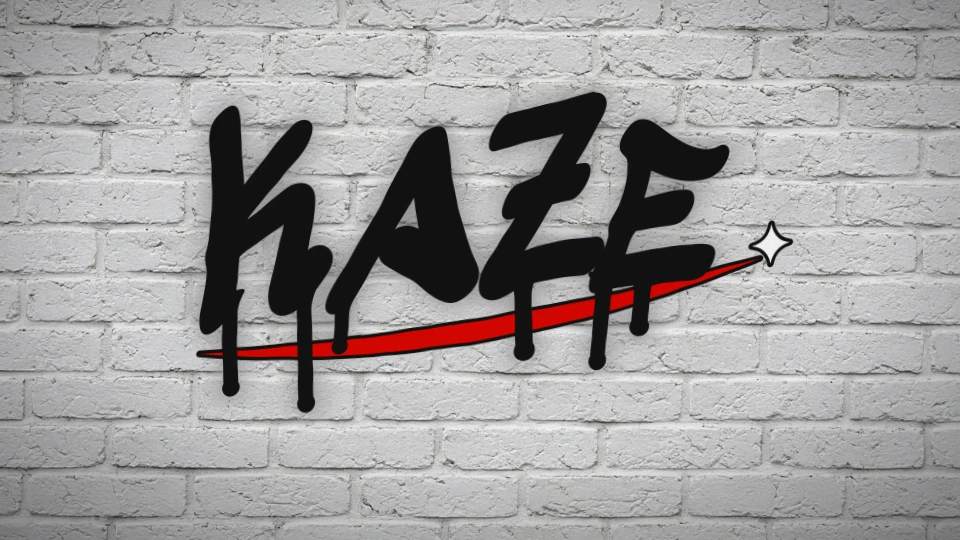
The tag is where every writer starts: a stylised signature done in one fluid motion. Tagging spread from Philadelphia and New York in the late 1960s and early 70s, when writers like TAKI 183 made their names famous across the city. A good handstyle is about rhythm, consistent slant and confident flow.
- ✦ Keep one consistent slant
- ✦ Exaggerate the first and last letter
- ✦ Underline or crown it to finish
Throw-up
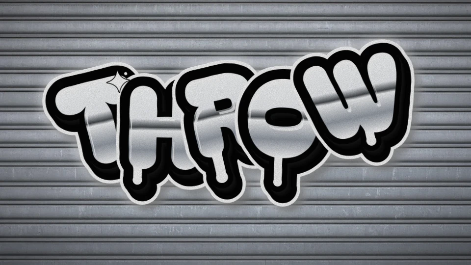
The throw-up sits between a tag and a full piece: big bubbly letters, usually two colours, painted fast. Silver fill with a black outline became the classic combination on New York subway cars because chrome paint covers quickly and pops from far away.
- ✦ Two colours, max three
- ✦ Let letters overlap and bounce
- ✦ Speed beats detail
Bubble letters
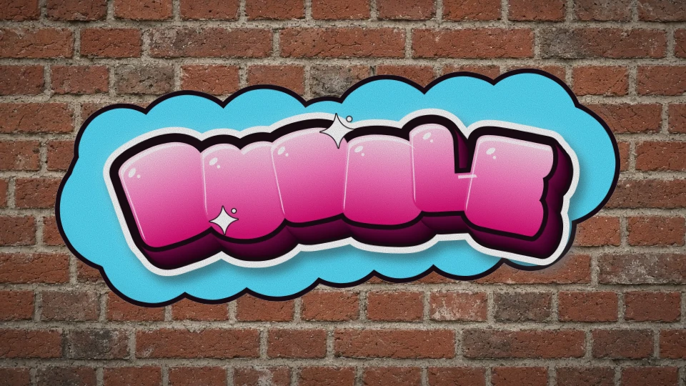
Soft, inflated letters — often called ‘softies’ — were popularised in the early 1970s and are still the friendliest entry into lettering. The trick is roundness everywhere: no sharp corners, small counters and letters that squash into each other like balloons.
- ✦ Round every corner
- ✦ Shrink the holes in A, O, R
- ✦ Add gloss dots top-left
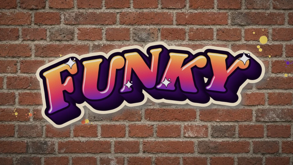
Piece & burner
‘Piece’ is short for masterpiece: a multi-colour work with fill, outline, 3D and highlights. When a piece is so good it ‘burns’ everything around it, writers call it a burner. Fades, cutlines and a clean 3D block are what separate a piece from a throw-up.
- ✦ Plan fill → outline → 3D → cutline
- ✦ Fade from light to dark
- ✦ Keep the cutline even
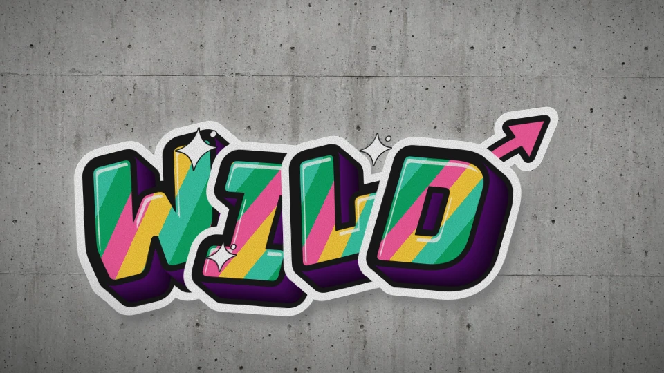
Wildstyle
Wildstyle is graffiti’s most intricate lettering — interlocking letters, arrows and connections that can be almost unreadable to outsiders. The name is tied to the New York crew Wild Style and the 1983 film of the same name. Mastery takes years; start from sharp, readable letters and add connections slowly.
- ✦ Start readable, then complicate
- ✦ Arrows point the reading direction
- ✦ Use split fills for energy
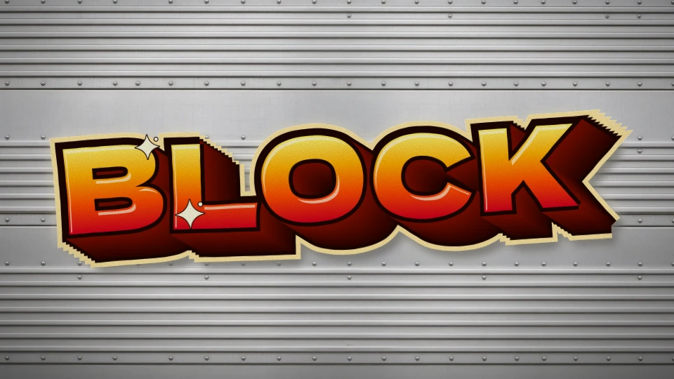
Blockbuster & 3D
Blockbusters are huge, square letters designed to cover a lot of wall fast — often filled with rollers. Their power comes from scale and a deep, consistent 3D block. Keep the 3D direction identical for every letter, or the piece falls apart.
- ✦ One 3D direction for all letters
- ✦ Shade the block near → far
- ✦ Outline the whole block
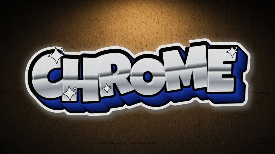
Chrome pieces
Chrome (silver) fills read as polished metal thanks to a hard horizon line inside the gradient — light on top, a dark band in the middle, light again below. Pair it with a deep blue or black 3D for maximum contrast.
- ✦ Add a sharp dark ‘horizon’ band
- ✦ Blue 3D is the classic match
- ✦ White sparkles sell the shine
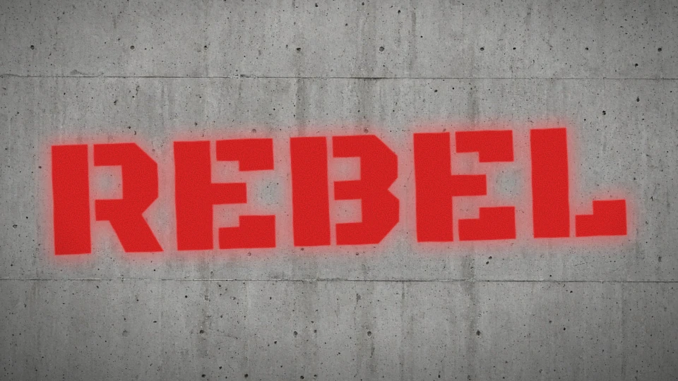
Stencil graffiti
Stencils let artists repeat crisp images and words in seconds. The style took off with Blek le Rat in Paris in the early 1980s and later went global through artists such as Banksy. Single colour, bold shapes and a soft halo of overspray are its signature.
- ✦ Keep bridges in letters like O and A
- ✦ Spray from 20–30 cm
- ✦ Overspray is part of the look
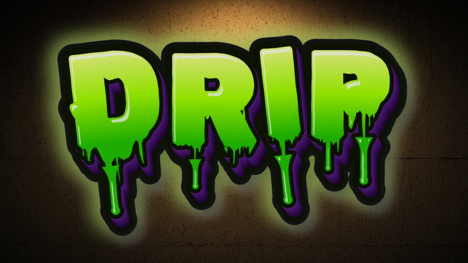
Drips
Drips began as accidents — too much paint, a fat cap held too long. Writers adopted them as an aesthetic that says ‘wet, fresh, raw’. The best drips start at the lowest edge of a letter and end in a heavier bulb.
- ✦ Vary the drip lengths
- ✦ Drip from the bottom edges
- ✦ End each run with a bulb
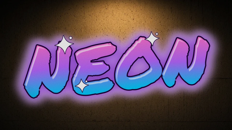
Neon & glow
Glows imitate the haze writers spray around pieces (often called a forcefield) and the light of neon tubes. On dark walls, a soft glow in the fill colour makes letters feel lit from inside.
- ✦ Use on dark walls
- ✦ Glow in the brightest fill colour
- ✦ Skip heavy 3D — let the light work
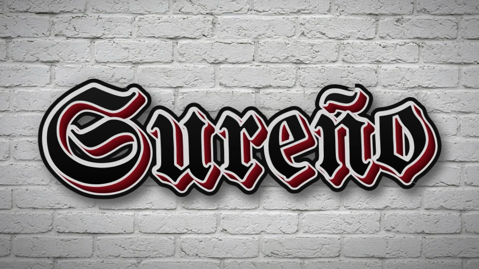
Old English & cholo lettering
Los Angeles cholo graffiti grew from Chicano neighbourhood ‘placas’ in the mid-20th century, using blackletter-influenced lettering to mark names and neighbourhoods. Crisp black letters, thin outlines and drop shadows define the look.
- ✦ Black fill, thin light outline
- ✦ Small, sharp drop shadow
- ✦ Mix capitals and lowercase
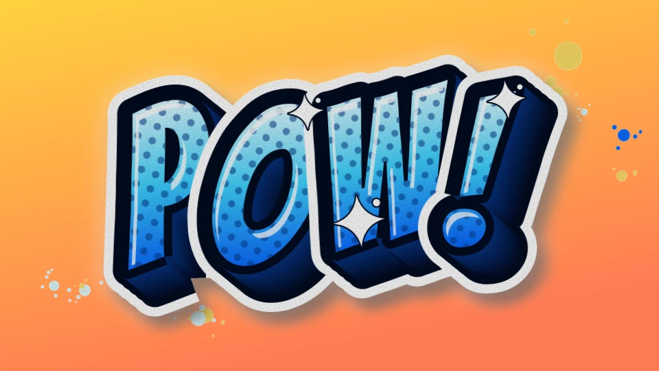
Pop & comic
Comic-book lettering — halftone dots, punchy 3D and splats — has been part of graffiti since characters started appearing next to pieces. It brings humour and instant readability.
- ✦ Halftone in the shadow side
- ✦ Bright cutline
- ✦ Add splats around
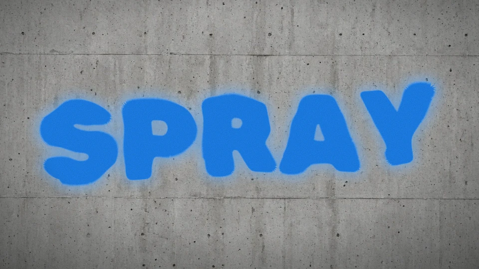
Raw spray
Straight letters sprayed freehand, with all the texture of the can left in: soft edges, mist and grain. It’s honest, fast and perfect for slogans.
- ✦ No outline needed
- ✦ Let the mist show
- ✦ Concrete is the best canvas
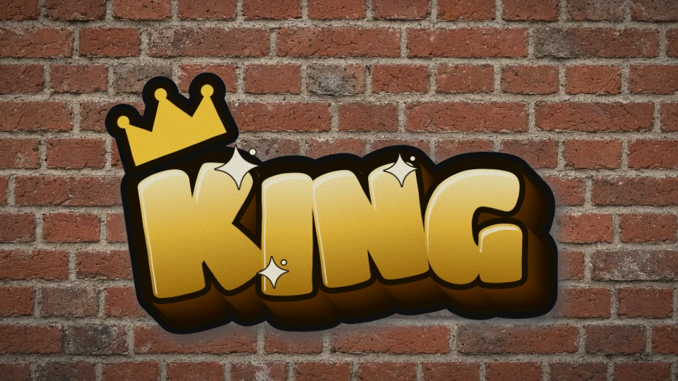
Crowns & kings
In graffiti a ‘king’ is the most respected writer on a line or in a style, and the crown above a name claims that status. Today crowns decorate logos and crew names worldwide.
- ✦ Crown the first letter
- ✦ Gold fill reads as royalty
- ✦ Keep it bold and simple
Talk like a writer
Graffiti glossary
36 terms every writer knows — from bite to whole car. Ready to try them? Open the graffiti generator.
- 3D
- The block or drop shadow that makes letters look solid, always stepping back in one consistent direction.
- All-city
- A writer whose work is seen in every part of a city or on every train line.
- Bite
- To copy another writer’s style or letters — one of the worst offences in graffiti.
- Blackbook
- A writer’s sketchbook for drafting letters, collecting tags from other writers and planning pieces.
- Blockbuster
- Huge, square letters designed to cover a large area quickly, often filled with rollers.
- Bombing
- Painting many tags or throw-ups in a short time to get your name everywhere.
- Buff
- The removal of graffiti by authorities — painting over it or chemically cleaning it.
- Burner
- An outstanding, colourful piece that ‘burns’ everything around it.
- Cap
- The nozzle on a spray can; fat caps spray wide lines, skinny caps thin ones.
- Character
- A figure or cartoon painted next to the letters of a piece.
- Crew
- A group of writers who paint together under a shared name or initials.
- Crossing out
- Painting over someone else’s work — a sign of disrespect or beef.
- Cutline
- The clean outer line around a whole piece that separates it from the wall, often white.
- Drip
- A run of paint below a letter, once a mistake, now a deliberate style element.
- End-to-end
- A piece that runs the full length of a subway car below the windows.
- Fill
- The colour inside the letters — solid, faded, split or patterned.
- Forcefield
- A glowing haze sprayed around a piece to make it pop from the wall.
- Getting up
- Becoming known by painting your name often and in visible places.
- Handstyle
- A writer’s personal way of writing their tag; the foundation of all lettering.
- Heaven spot
- A hard-to-reach, high location such as a rooftop or billboard top.
- Highlight
- Thin white shine lines or sparkles that make letters look glossy.
- King
- The most respected writer on a line, in a city or in a particular style.
- Outline
- The line drawn around each letter, defining its shape before the fill.
- Piece
- Short for masterpiece: a large, multi-colour graffiti painting.
- Production
- A large wall painted by several writers with a shared theme or background.
- Roller
- Graffiti painted with paint rollers, typically huge letters on walls or rooftops.
- Split fill
- A fill divided into bands or shards of different colours.
- Stencil
- A cut-out template used to spray crisp, repeatable images or words.
- Sticker / slap
- A tag drawn on a sticker and stuck up quickly in public places.
- Tag
- A writer’s stylised signature — the simplest and most common form of graffiti.
- Throw-up
- A quick, usually two-colour piece with bubbly letters, between a tag and a piece.
- Top-to-bottom
- A piece covering a subway car from roof to floor.
- Toy
- An inexperienced or unskilled writer; also used for bad work.
- Whole car
- A train car painted entirely, top-to-bottom and end-to-end.
- Wildstyle
- An intricate style of interlocking letters, arrows and connections.
- Writer
- What graffiti artists call themselves — they write their names.
同一段文字適合哪個效果,取決於它要放在哪裡、需要多容易讀,以及你想保留多少裝飾。本頁比較 Tagvoro 現有的五種工具效果,使用由本站繪製的實際範例;這不是完整的塗鴉藝術史或傳統風格分類。
先依用途選擇
- 名字與短暱稱:從手寫 Tag 或粗體字開始,先檢查小尺寸可讀性。
- 希望文字周圍有圖形與光感:試創意塗鴉,配合主色和背景調整。
- 想試尖角與交錯效果:選 Wildstyle,先用短字,再比較箭頭和裝飾是否遮住字形。
- 年份、日期、號碼或比分:使用數字工具,避免把數字當作隨機名字處理。
手寫 Tag
Permanent Marker 字體帶有筆刷感,搭配深色描邊及輕微傾斜。可先試四到八個字母;這是字體效果,不是記錄你筆跡的自由畫筆。
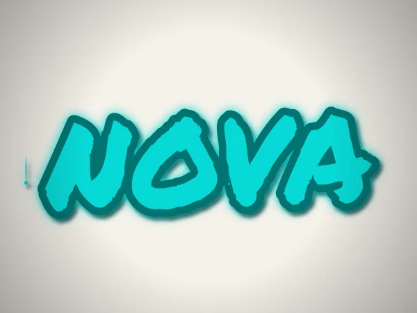
此範例的發光、陰影及滴漆均開啟。點擊下方連結可載入相同文字、主色、背景與構圖,再自行調整。
在工具中開啟這組設定 →創意塗鴉
Bungee 粗體文字搭配彩色圖形與程序化裝飾。按產生可改變構圖,不會呼叫 AI 模型。注意圖形與文字的對比;若裝飾搶走標題焦點,可減少效果。
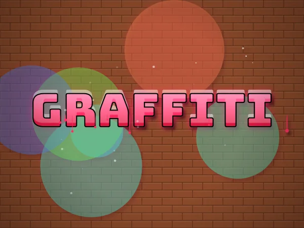
此範例的發光、陰影及滴漆均開啟。點擊下方連結可載入相同文字、主色、背景與構圖,再自行調整。
在工具中開啟這組設定 →Wildstyle 狂野靈感
Rubik Spray Paint 提供噴漆紋理,程式再加入傾斜、深度、箭頭與尖角。短字較有空間呈現輪廓。這是數位風格演繹,不代表重現某位寫手的筆跡,也不是可逐字自由變形的編輯系統。
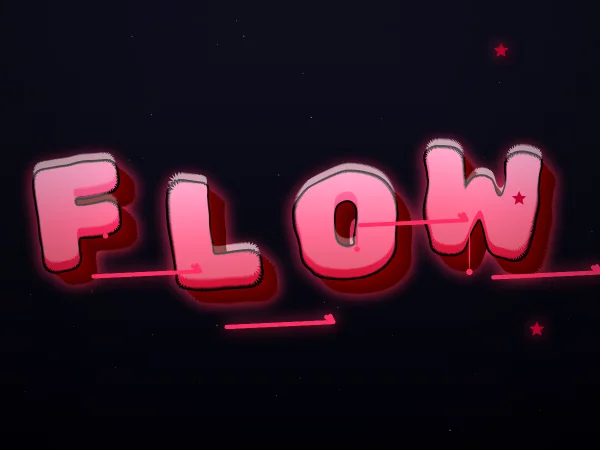
此範例的發光、陰影及滴漆均開啟。點擊下方連結可載入相同文字、主色、背景與構圖,再自行調整。
在工具中開啟這組設定 →粗體字風格
Bungee 方塊感的字形與多層描邊讓文字本身成為重點。需要清楚可讀時可從這個模式開始。輸出是圖片,不是可安裝的字體,也不是能貼到個人簡介的 Unicode 裝飾文字。
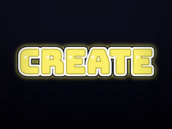
此範例的發光、陰影及滴漆均開啟。點擊下方連結可載入相同文字、主色、背景與構圖,再自行調整。
在工具中開啟這組設定 →數字塗鴉
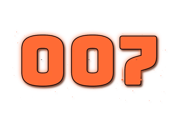
數字模式使用粗體字形與模板感裝飾,保留前導零及支援的日期或比分分隔符號。可試 2026、007 或 3-1,再檢查相似數字是否容易辨認。此模式不接受字母或羅馬數字。
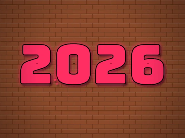
此範例的發光、陰影及滴漆均開啟。點擊下方連結可載入相同文字、主色、背景與構圖,再自行調整。
在工具中開啟這組設定 →用相同條件比較
在工具中保留同一段短文字、主色與背景,再逐一切換風格。接著把發光、陰影與滴漆一次只改一項,觀察可讀性。這比同時換字、換背景和換效果,更容易看出差異。
這三款自托管字體主要用於本工具的拉丁文字及數字。不支援的中文字或其他字元可能回退至裝置字體,外觀會不同;請用你實際要匯出的文字測試。
如何讓朋友比較同一組風格設定?
複製分享連結可保留文字、主色、次色、字體、材質、效果、種子與裁切設定。朋友打開後會編輯自己的副本;按重新生成會改變構圖,回到原連結可重現同一版本。私人分享頁預設不索引,也不會自動上作品牆;持有完整連結仍可讀取設定。