Choose a graffiti style: five tool styles compared
Tagvoro · Updated October 18, 2026
The right treatment depends on where your lettering will appear, how quickly it needs to be read and how much decoration you want. This guide compares Tagvoro’s five existing tool styles using artwork rendered by the tool. It is not a complete history or taxonomy of graffiti art.
Choose by the job your lettering needs to do
- Names and short nicknames: start with Free Tag or Font Style and check readability at a small size.
- A title with shapes and lighting around it: try Creative Piece and coordinate the main color with its background.
- Angular, overlapping effects: choose Wildstyle, keep the word short and check whether arrows and decoration obscure its shapes.
- Years, dates, numbers or scores: use the numbers tool so the input is handled as a number design.
Free Tag
Permanent Marker gives a short name a brush-like shape with a darker outline and a small tilt. Start with four to eight letters. This is font-based lettering, not a freehand brush that records your strokes.
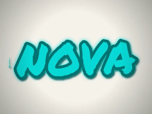
Glow, shadow and drips are on in this example. Open the link below to load its text, main color, background and arrangement, then make your own adjustments.
Open these settings in the tool →Creative Piece
Bold Bungee lettering is combined with colored shapes and procedural decoration. Generate changes the arrangement; it does not call an AI model. Compare the lettering against the shapes and reduce effects if they distract from a short title.
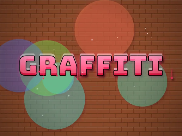
Glow, shadow and drips are on in this example. Open the link below to load its text, main color, background and arrangement, then make your own adjustments.
Open these settings in the tool →Wildstyle-inspired
Rubik Spray Paint adds a sprayed texture while the renderer tilts letters and adds depth, arrows and sharp accents. Short words give the shapes more room. This is a digital interpretation, not a claim to reproduce an individual graffiti writer’s handstyle or a full letter-editing system.
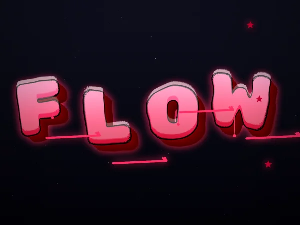
Glow, shadow and drips are on in this example. Open the link below to load its text, main color, background and arrangement, then make your own adjustments.
Open these settings in the tool →Font Style
Bungee’s blocky shapes and layered outlines emphasize the word itself. It is a useful starting point when readability matters more than decoration. The download is an image; it is not an installable font or copy-and-paste Unicode text.
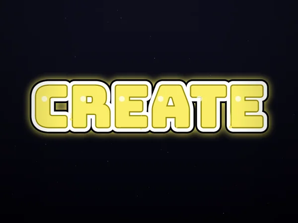
Glow, shadow and drips are on in this example. Open the link below to load its text, main color, background and arrangement, then make your own adjustments.
Open these settings in the tool →Numbers
Numbers uses bold digits and stencil-like accents. Leading zeros and supported date or score separators are preserved. Start with 2026, 007 or 3-1, then check that similar digits remain distinct. Letters and Roman numerals are not accepted in this mode.
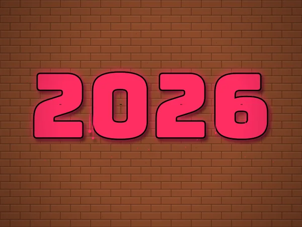
Glow, shadow and drips are on in this example. Open the link below to load its text, main color, background and arrangement, then make your own adjustments.
Open these settings in the tool →Compare styles under the same conditions
Keep the same short text, main color and background while switching styles in the editor. Then change just one of glow, shadow or drips at a time and watch the readability. This makes differences easier to judge than changing the word, background and effects together.
The three self-hosted fonts are used for the tool’s supported lettering and digits. Chinese and other unsupported glyphs may fall back to device fonts and look different. Test with the exact text you intend to export.